
Visual
The logo system
Four steps of the mark, a wordmark, and two lockups built from them. All fixed artwork: place it, scale it, recolor it to an approved value.
Form
StepLogomark only
Ground
OverlaysLockups only

What breaks the mark
Never
Do not squish, squeeze or distort. Do not add unnecessary effects. Do not change the scale of the logo lockup. Do not use unapproved colors.
Never set it as live text
Every file ships in ink. To produce another colorway, set the fill to an approved palette value rather than editing the paths, and never set the wordmark in a brand font as type.
Visual
Color
Mineral pigments that resist fading, on a closed list of pairings. Click a swatch to copy it.
Primary
Secondary
Neutrals
Tints
Transparency
Semantic names
| --text | --ink | Copy |
| --surface | --white | Copy |
| --background | --ground | Copy |
| --accent | --red-ochre | Copy |
| --accent-2 | --orange-ochre | Copy |
| --accent-4 | --blue | Copy |
| --accent-5 | --green | Copy |
The names bound directly to properties.
Approved pairings
What breaks the system
No
black backgrounds
No
full-color backgrounds, though imagery is permitted
No
any pairing of two colors that contrast sharply against one another
Visual
Typography
Two fonts, thirteen levels. Which row you use is a rule, not a matter of taste. Click a row to copy its CSS.
Display
Aa
Rhymes Text, in Light and Regular. A modern serif with high contrast strokes and refined proportions. Set headlines in Light, with Regular reserved for subheads. Keep the type large enough to let the contrast between thick and thin strokes read clearly.
Text
Aa
System, in Regular. The workhorse. A clean, grotesque-influenced sans built for the body copy, labels, and interface text that carries the brand's daily communication.
Headline
Title
Body
Label
Visual
Layout
The spacing, canvas and corner tokens to pull from, and the rule that goes with each one.
The canvas
| --layout-module | 90px | the module | Copy |
| --canvas-desktop | 1512px | canvas | Copy |
| --canvas-mobile | 393px | canvas | Copy |
| --rail-width | 90px | navigation rail | Copy |
| --rail-padding-inline | 34px | navigation rail | Copy |
| --margin-left | 180px | section margin | Copy |
| --margin-right | 90px | section margin | Copy |
| --section-padding-block | 240px | section padding | Copy |
| --section-padding-block-loose | 264px | section padding | Copy |
| --width-full | 1256px | content width | Copy |
| --width-column | 610px | content width | Copy |
| --width-narrow | 414px | content width | Copy |
The four gaps
Corners, and the space around everything
Two radii, and no scale
Cards, image blocks and panels take 6px. The role tag takes 100px, a full round. Everything else sits square, and adding a scale between them changes the character of the layout.
Whitespace is the point
The vertical padding is large on purpose. A layout that fills its margins to fit more in is off-system, even when every color and type value is right.
Visual
Art direction
Graphite for people, pigment for everything else. Mineral pigment, which has held its color for tens of thousands of years.
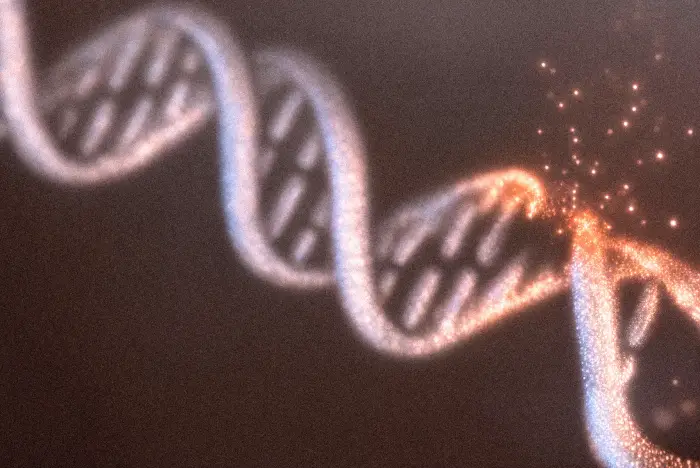
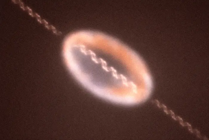
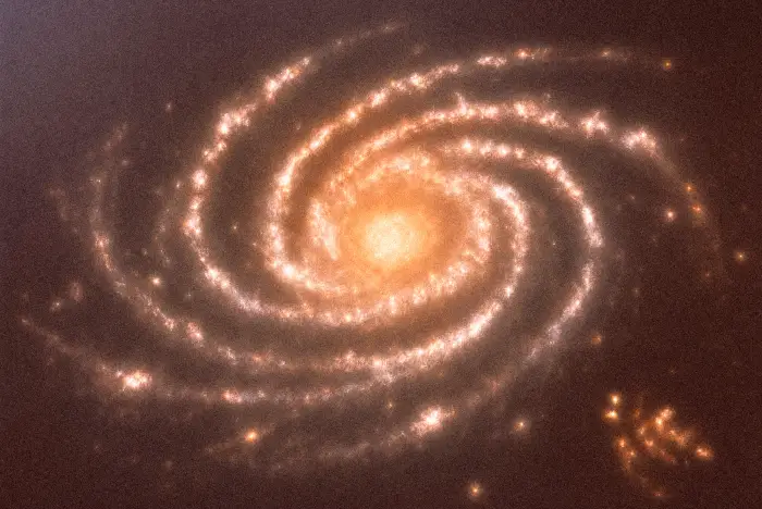
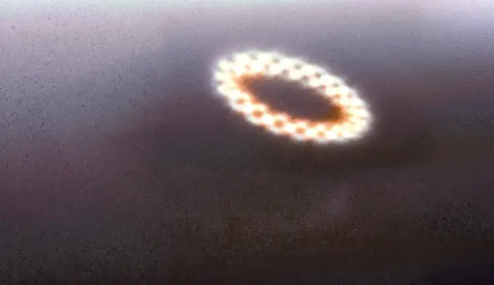
The art direction standard
Portraits
Graphite pencil, loose gestural linework that stays controlled rather than sloppy, set against a beige field. The drawing sits small in a wide field, and that ratio is the direction rather than a crop waiting to happen. Every portrait holds the same graphite tone and the same field, so a set of them reads as one team.
Illustration
These illustrations render scientific forms, helixes, cellular structures, protein folds, in warm, painterly pigment, with the same grain and depth found in early cave paintings. Keep the underlying science accurate wherever the subject demands it, and render every image in the same warm, grain-textured pigment style.
Color in imagery
The secondary palette lives mostly here. A full-color background is not permitted in layout, but imagery is exempt: an illustration may carry color edge to edge.
What to avoid
Stock photography, clinical laboratory imagery, and the blue-gradient visual language of ordinary biotech. The whole point of the pigment and graphite direction is that it does not look like that.


Office supplies
Stationery and the everyday printed items. The short elevator pitch is the standard body copy on these.
Merch
Apparel and physical goods. The logomark alone usually does the work, since the full lockup rarely has the room it needs.
Digital
Social, email and interface surfaces. The numbered eyebrow and the short standfirst pattern live here, as do team bios: a graphite portrait with a name, a role and a short paragraph.
Out of home
Posters and large format. For OOH, social, and email marketing, headlines can shift to Red Ochre or Blue instead of Ink. Body copy stays neutral regardless of the headline color chosen.
Visual
Motion
Four curves, three durations, three distances, four stagger intervals. Every value here plays on the page, so a token is watched before it is read.
The principle
Restrained, deliberate motion that follows the mark's own story: damage, repair, rest.
Two curves carry everything.
Every entrance layers ease.neutral for opacity with ease.enter for lift.
Easing curves
Opacity curve
ease.neutral
cubic-bezier(0.5, 0, 0.5, 1)
A gentle ease in both directions. Nothing appears or disappears abruptly.
Lift curve
ease.enter
cubic-bezier(0, 0, 0.2, 1)
Fast out, slow to arrive. Every element eases to a stop instead of hitting one.
Composed entrance
both, in parallel
opacity + lift · 1,000ms
Both curves run at once, on the same clock. This is the default arrival.
| ease.neutral | cubic-bezier(0.5, 0, 0.5, 1) | opacity, soft fades, shimmer | Copy |
| ease.enter | cubic-bezier(0, 0, 0.2, 1) | entrance lift and translateY | Copy |
| ease.standard | cubic-bezier(0.4, 0, 0.2, 1) | hover, press, image reveal | Copy |
| ease.exit | cubic-bezier(0.4, 0, 1, 1) | dismiss, exit, collapse | Copy |
One translucent button.
The brand's own call to action: white at 90 percent on a dark ground, going fully opaque on hover.
Button hover state
| --motion-duration-react-in | 200ms | Hover / press response, the fast half of the asymmetric pair | Copy |
| --motion-duration-react-out | 400ms | Hover / press release, settles slower than it engaged | Copy |
| --motion-duration-press | 80ms | Press (:active), scale(0.98), immediate tactile feedback | Copy |
Small moves only.
Three lift values, one per context. Everything taking part in an entrance travels the same distance; nothing goes further than the largest.
Movement distance
Labels and metadata
Program status
Content cards
The work
Interception
Programs
Rewrite the sentence biology already started.
Repair
Platform
Restore what the damage took, rather than replace it.
Readout
Evidence
First human data, and what it will and will not show.
Display hero
Platform
Repair, not replacement.
Interception rewrites the sentence biology already started, before the damage compounds.
See the platform
8pxSmall interface elements
The move is barely a move: enough to register as arriving without pulling the eye off the content it sits beside.
12pxCards and content reveals
The everyday distance for a piece of content. Noticeable, and still short of a flourish.
20pxDisplay and hero compositions
Display work, where the composition is the subject. The whole entrance shares the distance rather than the heading alone.
| --motion-lift-micro | 8px | Element accents · labels | Copy |
| --motion-lift-macro | 12px | Cards · content reveals | Copy |
| --motion-lift-hero | 20px | Display headings | Copy |
Order, not spectacle.
Duration and easing hold steady; only the gap between siblings changes. Four intervals, each in the situation it was written for.
Stagger behavior
Loading state
Cards and list rows
Interception
Programs
Repair
Platform
Readout
First human data, and what it will not show.
Reach
Where the work lands, and on what terms.
Reserve
What is held back, and for how long.
Collection
Helix
Torus
Galaxy
Ring
Campaign hero
Campaign
A longer life,
lived well.
The moonshot, stated plainly and without a claim the evidence has not reached yet.
Read the thesis
0msUtility UI and skeletons
Arrives as one state change. Utility UI narrates nothing, so nothing waits its turn.
120msCards, lists and UI reveals
The everyday rhythm. Rows enter in reading order, close enough to read as one list settling.
180msCollections and storefronts
More room between siblings, so each item registers before the next arrives.
240msHero and campaign work
The most deliberate cadence in the system, for a composition that has an order to tell.
| --motion-stagger-simultaneous | 0ms | utility UI · skeletons | Copy |
| --motion-stagger-default | 120ms | cards · lists · UI reveals | Copy |
| --motion-stagger-feature | 180ms | collections · storefronts | Copy |
| --motion-stagger-narrative | 240ms | hero · campaigns | Copy |
Put together.
Every rule above becomes one reveal here: opacity, lift, distance, and stagger, together.
Composed entrance
The team
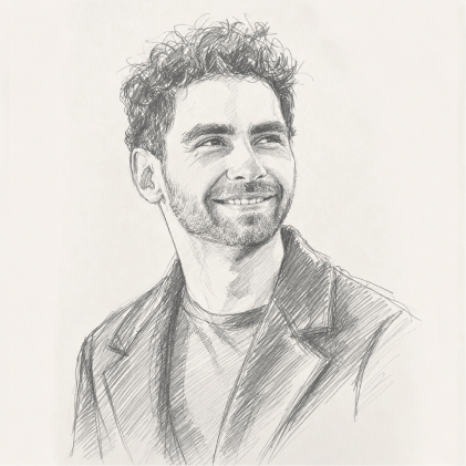
Alan Tomusiak, PhD
CEO
View bio
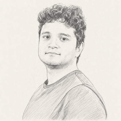
Carlos Galicia, PhD
Director of Research
View bio
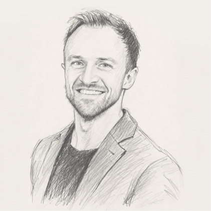
Eddie Anderton, PhD
Head of Development
View bio
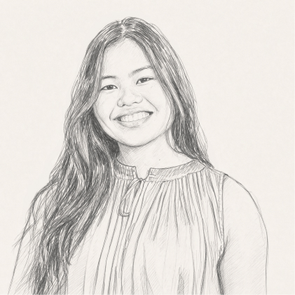
Katrina Mae Reyes
Computational Scientist
View bio
| --motion-duration-reveal | 1000ms | Composed entrance, opacity + lift together | Copy |
The rule for new motion
Before adding a new animation value, decide whether the interaction maps to one of the behaviors above: react-in/out, a composed reveal, or exit. Reuse the token that matches. Add a new token only when the interaction is a genuinely different behavior. Different components may animate different properties while still sharing the same token.
Interface
Tokens
The design system's tokens to pull from, generated from the one file that holds them. Copy a row, or take a family as a file.
Color22
| --ink | #231E1A | primary | Copy |
| --white | #FFFFFF | primary | Copy |
| --off-white | #FCFAF9 | primary | Copy |
| --red-ochre | #851C08 | primary | Copy |
| --orange-ochre | #CC7722 | secondary | Copy |
| --blue | #678FC9 | secondary | Copy |
| --green | #2B5A3E | secondary | Copy |
| --ground | #FBF8F1 | neutral | Copy |
| --beige | #F4F1EC | neutral | Copy |
| --dark-beige | #DCD8D1 | neutral | Copy |
| --red-ochre-15 | #E9D7CE | tint | Copy |
| --orange-ochre-15 | #F5E6D9 | tint | Copy |
| --blue-15 | #E5E8EB | tint | Copy |
| --green-15 | #DDE2DD | tint | Copy |
| --ink-75 | #231E1ABF | alpha | Copy |
| --text | var(--ink) | semantic | Copy |
| --surface | var(--white) | semantic | Copy |
| --background | var(--ground) | semantic | Copy |
| --accent | var(--red-ochre) | semantic | Copy |
| --accent-2 | var(--orange-ochre) | semantic | Copy |
| --accent-4 | var(--blue) | semantic | Copy |
| --accent-5 | var(--green) | semantic | Copy |
Type46
| --font-display | "Rhymes Text" | font family | Copy |
| --font-sans | "System" | font family | Copy |
| --weight-light | 300 | font weight | Copy |
| --weight-regular | 400 | font weight | Copy |
| --text-eyebrow-size | 16px | type ramp | Copy |
| --text-eyebrow-leading | 1.1 | type ramp | Copy |
| --text-eyebrow-tracking | 0.02em | type ramp | Copy |
| --text-headline-large-size | 96px | type ramp | Copy |
| --text-headline-large-leading | 90px | type ramp | Copy |
| --text-headline-large-tracking | -0.05em | type ramp | Copy |
| --text-headline-medium-size | 64px | type ramp | Copy |
| --text-headline-medium-leading | 1 | type ramp | Copy |
| --text-headline-medium-tracking | -0.04em | type ramp | Copy |
| --text-headline-small-size | 48px | type ramp | Copy |
| --text-headline-small-leading | 1 | type ramp | Copy |
| --text-headline-small-tracking | -0.04em | type ramp | Copy |
| --text-headline-x-small-size | 36px | type ramp | Copy |
| --text-headline-x-small-leading | 1 | type ramp | Copy |
| --text-headline-x-small-tracking | -0.04em | type ramp | Copy |
| --text-title-large-size | 24px | type ramp | Copy |
| --text-title-large-leading | 1.2 | type ramp | Copy |
| --text-title-large-tracking | -0.01em | type ramp | Copy |
| --text-title-medium-size | 20px | type ramp | Copy |
| --text-title-medium-leading | 1.2 | type ramp | Copy |
| --text-title-medium-tracking | -0.01em | type ramp | Copy |
| --text-title-small-size | 18px | type ramp | Copy |
| --text-title-small-leading | 1.2 | type ramp | Copy |
| --text-title-small-tracking | -0.01em | type ramp | Copy |
| --text-body-large-size | 22px | type ramp | Copy |
| --text-body-large-leading | 1.5 | type ramp | Copy |
| --text-body-large-tracking | 0em | type ramp | Copy |
| --text-body-medium-size | 18px | type ramp | Copy |
| --text-body-medium-leading | 1.5 | type ramp | Copy |
| --text-body-medium-tracking | 0em | type ramp | Copy |
| --text-body-small-size | 16px | type ramp | Copy |
| --text-body-small-leading | 1.4 | type ramp | Copy |
| --text-body-small-tracking | 0em | type ramp | Copy |
| --text-label-large-size | 18px | type ramp | Copy |
| --text-label-large-leading | 1.4 | type ramp | Copy |
| --text-label-large-tracking | 0.04em | type ramp | Copy |
| --text-label-medium-size | 16px | type ramp | Copy |
| --text-label-medium-leading | 1.4 | type ramp | Copy |
| --text-label-medium-tracking | 0.05em | type ramp | Copy |
| --text-label-small-size | 14px | type ramp | Copy |
| --text-label-small-leading | 1.4 | type ramp | Copy |
| --text-label-small-tracking | 0.05em | type ramp | Copy |
Layout24
| --layout-module | 90px | layout | Copy |
| --canvas-desktop | 1512px | layout | Copy |
| --canvas-mobile | 393px | layout | Copy |
| --rail-width | 90px | layout | Copy |
| --rail-padding-inline | 34px | layout | Copy |
| --rail-radius | 12px | layout | Copy |
| --margin-left | 180px | layout | Copy |
| --margin-right | 90px | layout | Copy |
| --section-padding-block | 240px | layout | Copy |
| --section-padding-block-loose | 264px | layout | Copy |
| --width-full | 1256px | layout | Copy |
| --width-column | 610px | layout | Copy |
| --width-narrow | 414px | layout | Copy |
| --gap-inner | 10px | layout | Copy |
| --gap-related | 20px | layout | Copy |
| --gap-parts | 55px | layout | Copy |
| --gap-blocks | 120px | layout | Copy |
| --radius-card | 6px | layout | Copy |
| --radius-pill | 100px | layout | Copy |
| --hairline | 1px | layout | Copy |
| --rule-mark | 27.5px | layout | Copy |
| --logo-min-height | 40px | logo | Copy |
| --tag-padding-inline | 10px | component | Copy |
| --tag-padding-block | 8px | component | Copy |
Motion18
| --motion-ease-neutral | cubic-bezier(0.5, 0, 0.5, 1) | motion easing | Copy |
| --motion-ease-enter | cubic-bezier(0, 0, 0.2, 1) | motion easing | Copy |
| --motion-ease-standard | cubic-bezier(0.4, 0, 0.2, 1) | motion easing | Copy |
| --motion-ease-exit | cubic-bezier(0.4, 0, 1, 1) | motion easing | Copy |
| --motion-duration-react-in | 200ms | motion duration | Copy |
| --motion-duration-react-out | 400ms | motion duration | Copy |
| --motion-duration-reveal | 1000ms | motion duration | Copy |
| --motion-duration-press | 80ms | motion duration | Copy |
| --motion-lift-micro | 8px | motion lift | Copy |
| --motion-lift-macro | 12px | motion lift | Copy |
| --motion-lift-hero | 20px | motion lift | Copy |
| --motion-stagger-simultaneous | 0ms | motion stagger | Copy |
| --motion-stagger-default | 120ms | motion stagger | Copy |
| --motion-stagger-feature | 180ms | motion stagger | Copy |
| --motion-stagger-narrative | 240ms | motion stagger | Copy |
| --motion-lift-micro | 4px | motion lift, mobile | Copy |
| --motion-lift-macro | 6px | motion lift, mobile | Copy |
| --motion-lift-hero | 10px | motion lift, mobile | Copy |
Click any row to copy its value, or take a family or the whole set as a file.